The pie chart compare way of accessing the news in Canada and Australia.

The pie chart compare way of accessing the news in Canada and Australia.
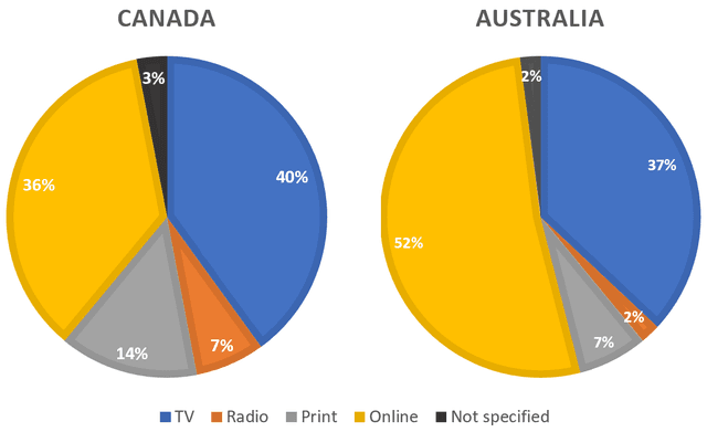
The given chart gives information about five types (TV, Radio, Print, Online, Not specified) of known news in Canadian and Australia.
Overall
, there are many changes in accessing the news among Canadian and Australians. The largest pie is TV in Canada, with about 40%. The most popular among Australians is Online , at 52%. Online in Canada and TV in Australia showed the second level, at 36% and 37% respectively. Radio and Not specified showed the same figure in Australia, consisting of 2%. But Not specified difference to one per cent in Canada, accounting for a very small number (3%). Radio significantly rise, at 7% just over three quarters. Print is considerably large, with about 4%. But
this
proportion doubled rise, with 14%.
Submitted by ieltsteaching0 on

Unauthorized use and/or duplication of this material without express and written permission from this site’s author and/or owner is strictly prohibited. Excerpts and links may be used, provided that full and clear credit is given to Writing9 with appropriate and specific direction to the original content.

Sentences: Add more complex sentences.
Common mistake: Your writing should be 150-250 words.
Vocabulary: The word "give" was used 2 times.
Vocabulary: The word "showed" was used 2 times.
Vocabulary: The word "rise" was used 2 times.
Vocabulary: The word "about" was used 3 times.
What to do next:
Look at other essays: