
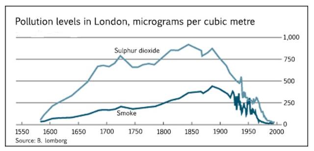
The provided graph illustrates the amount of pollution in London, measured in
micrograms
per cubic Use synonyms
metre
, from 1600 to 2000. In Use synonyms
this
essay, we are going to explain the comparison of trends for the parameters.
Linking Words
Overall
, the chart compares the levels of Linking Words
sulphur
Use synonyms
dioxide
and Use synonyms
smoke
per Use synonyms
micrograms
per cubic Use synonyms
metre
as the representing indicators. Starting at 0 Use synonyms
micrograms
per cubic just before 1600, both levels started to increase in the following years before declining much later around 1900 and ending at 0 in 2000.
Use synonyms
According to
the data, we can observe that the quantity of Linking Words
sulphur
Use synonyms
dioxide
and Use synonyms
smoke
diverged in 1600 since Use synonyms
sulphur
Use synonyms
dioxide
rose more rapidly. Use synonyms
Sulphur
Use synonyms
dioxide
numbers shot up from 0 to a little below 750 Use synonyms
micrograms
per cubic Use synonyms
metre
between 1600 and 1700, Use synonyms
whereas
Linking Words
smoke
grew only from 0 to less than 250 during the same period. Use synonyms
Subsequently
, the volume for both remained to rise steadily until the year 1850 when Linking Words
sulphur
Use synonyms
dioxide
levels reached an all-time high at approximately 800 Use synonyms
micrograms
per cubic Use synonyms
metre
. Use synonyms
This
is followed by a sharp decrease to as low as 500 Linking Words
micrograms
per cubic Use synonyms
metre
in the 1940s, before continuing to decline to 0 in 2000. Use synonyms
Similarly
for Linking Words
smoke
, it grew to its highest record in 1900 at 450 Use synonyms
micrograms
per cubic Use synonyms
metre
before declining after that. Even as the numbers moved erratically from 1900 to 1950, eventually the amount of Use synonyms
smoke
recorded in 2000 converged with that of Use synonyms
sulphur
Use synonyms
dioxide
at 0 Use synonyms
micrograms
per cubic Use synonyms
metre
.Use synonyms