
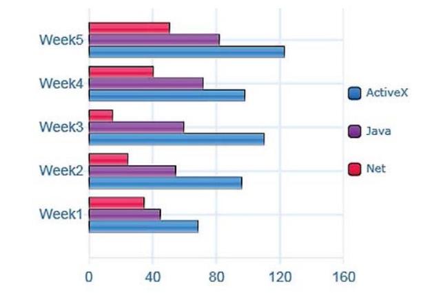
The given bar chart demonstrates data concerning how many times ActiveX, Java, and Net were downloaded within 5 weeks.
Overall
, it can be seen from the graph that ActiveX always outweighed the others in terms of downloading over the period. What is more, the Linking Words
quantity
of times Java was downloaded went up from Change the quantifier
number
week
1 to Use synonyms
week
5.
At a fleeting glance, the collection of Net witnessed a gradual decrease from approximately 35000 to 10000 in Use synonyms
week
3. Use synonyms
However
, Linking Words
this
figure rose again to reach nearly $50,000 Linking Words
at the end
of the term. At the same time, the Java application climbed moderately with no fluctuation, from about 50000 to sharply 80000.
Regarding the ActiveX package, the demand for it experienced some fluctuation, which was about 70000 in the beginning. Linking Words
Nevertheless
, Linking Words
this
seemed to go upward to 110000 in Linking Words
week
3 and ended up at the top of over 120000 in the final Use synonyms
week
.Use synonyms