
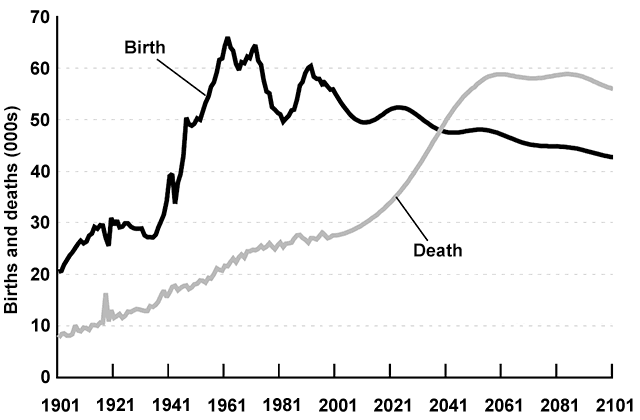
The provided chart illustrates the changes in
birth
and dying records in New Zealand over a 20-year period as a whole. Use synonyms
Birth
and Use synonyms
death
figures on the vertical axis are plotted against years. It is evident from the line graph that in the whole picture from 1901 to 2101 the Use synonyms
death
, and delivery rate got increased.
Speaking with more details, in the beginning, as 20 Use synonyms
birth
there was only 10 passing. Notable to mention that 1941 was a trigger point for the number of Use synonyms
birth
. Use synonyms
In other words
, New Zealand's population between 1941, and 1961, experienced a sharp jump from 30 newborns per day to its peak(something about 70 people per day). Linking Words
On the other hand
, the Linking Words
death
ratio had its steep growth starting in 2001 and Use synonyms
then
reached its highest score in 2061. What is more, in 2041 the national statistics stated that Linking Words
death
crossed over Use synonyms
birth
, and since Use synonyms
then
, the situation has been steady.
Linking Words
To sum up
, by a quick look at the line chart it is obvious that at Linking Words
first,
more children used to get Linking Words
birth
than people used to die. Use synonyms
However
, the situation didn't Linking Words
last
forever, so Linking Words
at the end
of the era, Linking Words
death
overcame Use synonyms
birth
.Use synonyms