
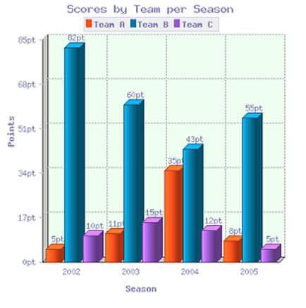
The given bar chart depicts the amount that teams A and received from 2002 to 2005.
Overall
, it can be clearly seen thatLinking Words
,
Remove the comma
apply
initially
team had the highest score, Linking Words
while
A had the fewest.
Linking Words
Firstly
, in 2002 unit A had 5, Linking Words
whereas
the squad ranked second and got on 5 points more. At the top was the club with a rate of 82, Linking Words
however
in the next year they rapidly decreased by a little more than 20 points. At the same time, the score of team A steadily went up just over twice and a half, respectively.
Regarding the 2004 year, the number of team A incredibly grew up about three times reaching the peak, whilst organization B had a downward trend until 43 hitting the bottom. Linking Words
In addition
, party scores since Linking Words
this
year started descending tendency of 3 and almost twice in 2005 reaching the nadir. Linking Words
Moreover
, the rate of side A Linking Words
also
dramatically collapsed approximately by 4 times, but the company had improved to 55.Linking Words