
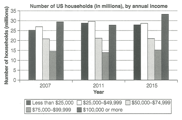
The bar chart displays what number of household's annual
income
has changed in three time periods (2007,2011 and 2015) in the country of the US.
Use synonyms
Overall
, Linking Words
Households
which were earning the highest were kept on increasing Use synonyms
while
, the Linking Words
families
whose annual Use synonyms
income
was less than most average Use synonyms
households
were fluctuating throughout the period and some average annual earners were ranging in number of Use synonyms
households
.
At the beginning of the period, the vast majority of Use synonyms
households
' Use synonyms
income
was more than $100,000 which is almost 30 Use synonyms
million
Use synonyms
Households
Use synonyms
nonetheless
, Linking Words
this
figure kept on rising to approximately 33 Linking Words
million
Use synonyms
households
who were earning Use synonyms
this
much Linking Words
income
in the year 2015. Use synonyms
Although
, there was a slight dip in 2011 when Linking Words
families
of houses were depleted by around 5 Use synonyms
million
Use synonyms
households
. Use synonyms
Furthermore
, Linking Words
families
which were accumulating an average Use synonyms
income
between $50,000 to $75,000 ranged from 13 Use synonyms
million
to 15 Use synonyms
million
Use synonyms
families
throughout the period.
Use synonyms
Households
in the US which were earning less than $50,000 were fluctuating. In 2007, these Use synonyms
families
were at around 25-27 Use synonyms
million
but in the next four years it jumped to almost 30 Use synonyms
million
Use synonyms
households
and by the year 2015, they dwindled in numbers to an average of 27 Use synonyms
million
Use synonyms
households
.Use synonyms