
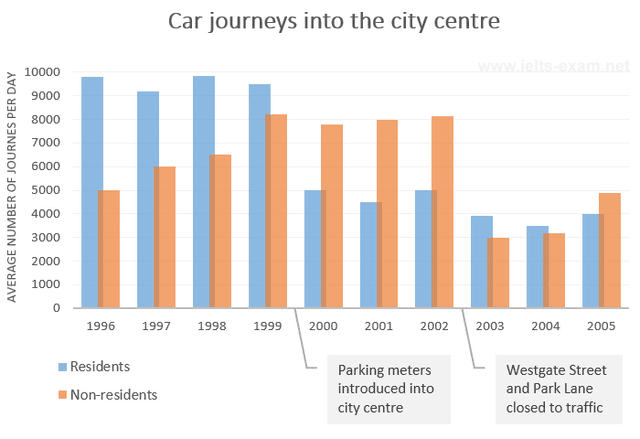
The given bar chart portrays the data regarding
residents
' and non-Use synonyms
residents
'Use synonyms
residents
's amount of cars travelling into the heart of the city.
It is immediately noticeable that Use synonyms
residents
experienced a downward trend, Use synonyms
while
non-Linking Words
residents
displayed an upward trend throughout the period. Both groups' journey rates had some fluctuations. Use synonyms
Although
Linking Words
residents
Use synonyms
initially
had a higher Linking Words
rate
, it outraced non-Use synonyms
residents
at the final of the period.
A closer inspection of the trends illustrates that Use synonyms
residents
' vehicle journeys Use synonyms
rate
was about 9,800 in 1996, being considerably higher than non-resident's Use synonyms
rate
by approximately 4,800. Use synonyms
Then
, it declined to around 9,200 in 1997 and it slightly increase to a similar amount at the beginning one year after. Linking Words
However
, the figure depicted a gradual decrease to nearly 9,500 in 1999, reaching the bottom at 3,500 in 2004 and continued to fluctuate steadily to the end of the period
Linking Words
On the contrary
, the percentage of cars travelling to the centre from non-resident drivers was 5,000 in 1996, and it moderately surged roughly 6,000 to 6,500 respectively between 1997 to 1998, prior the hitting a peak of approximately 8,200 in 1999. Linking Words
Furthermore
, the figure experienced a minimal fluctuation during the next three years, before it noticeably dropped from about 8,100 to 3,000 between 2002 and 2003. Linking Words
Thereafter
, it grew progressively to almost 5,000 in 2005, outracing the Linking Words
rate
of Use synonyms
residents
.Use synonyms