
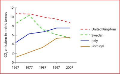
The graph illustrates the changes in the amount of CO2 consumed by every person from 4 different countries , from 1967 to 2007. The units are measured in metric tonnes.
Overall
, Linking Words
while
the emission of carbon dioxide per person has significantly increased in Italy and Portugal, the United Kingdom and Sweden have encountered a decrease in consumption.
Linking Words
Firstly
, beginning with the two countries that have had an increase in CO2 emission, Portugal started from less than 2 metric tonnes per individual in 1967 and increased constantly until 2007 , reaching over 4 tons. Linking Words
Similarly
, Italy's fuel consumption has grown from over 4 metric tonnes in 1967 to nearly 8 in 2007.
Linking Words
Secondly
, continuing with the other two countries that have encountered a decrease in the trend of fuel usage , Sweden started from more than 8 metric tons at the beginning of the period, reached its peak of over 10 units in 1977, and Linking Words
then
decreased uniformly until 2007, becoming a bit over 4000 kilograms. United King's usage has constantly decreased in the given period, from nearly 11000 kilograms to less than 10000 in 2007.Linking Words