
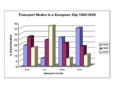
The bar chart above compares various types of travelling in terms of popularity during 1960,1980 and 2000 years.
Overall
, it can be clearly seen that Linking Words
while
the figure of cars has been increasing significantly,other means of transport witnessed a fall
Linking Words
While
the number of car users started at a low rate, the trend of walking accounted for almost 40 per cent. Linking Words
However
1980 saw the opposite situation, the car rate became more than a foot with 23% and 17% respectively. Linking Words
Furthermore
, the car rate rocketed to over 35% and the figure for walking plummeted to 10%
Regarding buses, it stood at roughly 17% , Linking Words
then
it rose and reached approximately, Linking Words
moreover
, the trend of buses plunged to half of the third.
In the beginning, the bike was in the middle with a quarter of a hundred ,afterwards, there was a decline to around fifth per cent in 1980 .Linking Words
Then
Linking Words
finally
,in 2000 the bike mode collapsed to just over 5%Linking Words