
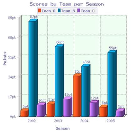
The provided bar chart illustrates the data regarding the
points
of three different Use synonyms
teams
between 2001 and 2004.
Use synonyms
Overall
, Linking Words
Team
Use synonyms
B
consistently had the highest Use synonyms
score
throughout the period Use synonyms
while
the Linking Words
points
of Use synonyms
Teams
A and Use synonyms
C
fluctuated.
Use synonyms
To begin
, in 2002, Linking Words
Team
A won 5 Use synonyms
points
which was approximately 16 times lower than Use synonyms
Team
Use synonyms
B
’s. The Use synonyms
score
of Use synonyms
Team
Use synonyms
C
was twice that of Use synonyms
Team
A. Use synonyms
However
, Linking Words
this
upward trend was abruptly broken and the Linking Words
score
of Use synonyms
Team
Use synonyms
B
plummeted dramatically, standing at 62 Use synonyms
points
in 2003. Use synonyms
Nonetheless
, Linking Words
team
Use synonyms
B
maintained its leadership position, and slight changes were observed in Use synonyms
teams
A and Use synonyms
C
with an increase of around 5 Use synonyms
points
.
In 2004, there was a sharp rise in Use synonyms
Team
A’s Use synonyms
score
, as they gained 35 Use synonyms
points
which was slightly lower than Use synonyms
Team
Use synonyms
B
's gain of 8 Use synonyms
points
. Use synonyms
Conversely
, Linking Words
Team
Use synonyms
C
lost its Use synonyms
points
and only stood at 12 Use synonyms
points
. Use synonyms
Finally
, Linking Words
Team
A showed a significant rise back reaching 55 Use synonyms
points
, Use synonyms
while
Linking Words
Teams
A and Use synonyms
B
accounted for 8 and 5 Use synonyms
points
.Use synonyms