
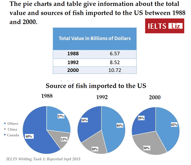
The data provides information on the fish
sources
Use synonyms
as well as
the total value of imports to the US from 1988 to 2000. Linking Words
Overall
, over the Linking Words
period
the total value grew exponentially and the shares of Use synonyms
sources
became more evenly distributed by the end of the given Use synonyms
period
.
At the beginning of the Use synonyms
period
, Canada sourced the vast majority of fish, Use synonyms
however
, its place was taken by other Linking Words
sources
in 1992, which continued their dominance up until the end of the Use synonyms
period
with 42% of shares, but first reaching a peak in 1992 of 46% before slightly dropping. Canada started as the main source and ended up being the smallest one by the end of the Use synonyms
period
.
In terms of China, its share grew strongly over the years by nearly 20 per cent taking one-third of the total Use synonyms
sources
in 2000. Compared to the start of the Use synonyms
period
, when there was a clear dominant source, at the final stage, the difference in shares is not that significant. The difference between the biggest source and the smallest one decreased in 12 years. In 1988 it was 47% and in 2000 only 12%.Use synonyms