
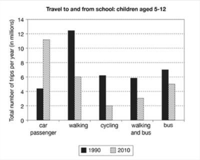
The chart, which depicts great detail, provides information about the total amount of journeys made by infants on their way to school and back home between 1990 and 2010 in one country using different possibilities of transport.
Undoubtedly, walking was the preferred option in the 90s. Meanwhile, the mode of transport that collects higher quota in the first decade of the 20th century is represented by the car.
Travelling options to move around somewhere vary with the passing of time.
As a result
, in the course of 20 years, the younger students have changed their preferences in order to get to school and arrive home later. Linking Words
Furthermore
, the numbers shown in the picture that correspond to trips made by car rose from 4 in 1990 to 11 million in 2010. In relation to walking, the numbers decline from a total amount of 12 to 6 Linking Words
at the end
of the period. Linking Words
However
, other variables maintain their stability as evidenced in the depiction.
Linking Words
To sum up
, walking and being a car passenger are the modes of transport that varied the most during the two decades.Linking Words