
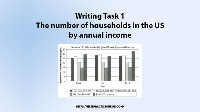
The bar graph compares the total of
families
in five different income levels in 2007, 2011, and 2015.
In general, the number of Use synonyms
families
in all income levels increased gradually over the period, despite one category remained unchanged.
In detail, houses in the range of $100,000 or more, which is the majority of the population, had experienced an upward from almost 30 Use synonyms
million
in 2007 to over 32 Use synonyms
million
in 2015, except for a small dip in 2011. Use synonyms
Likewise
, the number of Linking Words
families
with salaries less than $25,000 rose gradually from 25 Use synonyms
million
to around 27 Use synonyms
million
in the same period.
Use synonyms
On the other hand
, Linking Words
families
with an income level of $25,000-$49,999 had increased steadily from around 26 Use synonyms
million
in 2007 to almost 30 Use synonyms
million
in 2015. Use synonyms
Similarly
, Linking Words
families
in the range of $75,000-$99,999, which is the smallest population, rose steadily to 15 Use synonyms
million
in the same year.
Use synonyms
However
, Linking Words
while
the other four categories had increased, Linking Words
families
with the range of $50,000-$74,999 stayed constant at around 21 Use synonyms
million
during the periodsUse synonyms