
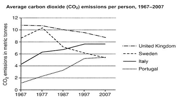
The graph provides information about the average carbon dioxide (CO2) emissions per individual in the United Kingdom, Sweden, Italy and Portugal between 1967 and 2007.
Overall
, it is clear from the line graph that Italy and Portugal Linking Words
initially
experienced a low emission. Eventually, it managed to incline till the end of the year. Linking Words
However
, Linking Words
figure
shows the United Kingdom and Sweden had a good increase in the start but failed to increase over the period of years. Add an article
the figure
Moreover
, all the countries had some fluctuations.
Linking Words
Firstly
, in 1967 CO2 emission in Linking Words
the
Portugal had approximately one metric Correct article usage
apply
Use synonyms
tonnes
and escalated a steady growth for the following decades. During the period of 1977, it rose around 2 Change to a singular noun
tonne
tonnes
followed by the upcoming decade it Use synonyms
inclines
almost 4 Wrong verb form
inclined
tonnes
and experienced a steady line in the years 1977 and 2007. Use synonyms
Whereas
, Italy had a similar Linking Words
inclanation
compared to Portugal having double-half of its metric to Correct your spelling
inclination
tonnes
.
Use synonyms
Secondly
, the United Kingdom had larger Linking Words
emission
of almost 11 metics at first and started to show Fix the agreement mistake
emissions
downtrend
for the upcoming decades. Correct article usage
a downtrend
Furthermore
, Sweden Linking Words
initially
started at the point of 8 metrics and made a significant growth in 1977 ranging the level of above 10 metrics and produced a drastic decrease in the year 1987 followed by the next decade and ended up in 2007 with the metric of almost 5.Linking Words