
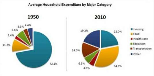
The pie charts compare the average spending for various 6 types of household
activities
in France in 1950 and 2010.
Use synonyms
Overall
, the expenditure for housing is the dominant part of total expenses in 1950 Linking Words
while
it accounts Linking Words
only
a quarter of the chart in 2010.
On the one hand, France's population spent the main part of their income on housing Change preposition
for only
activities
which was 3 times more than another 5 expenses Use synonyms
such
as food, health care, education, transportation and other household Linking Words
activities
in 1950. Use synonyms
In addition
to Linking Words
this
, food spending was the second highest amount in 1950 spending.
Linking Words
On the other hand
, food expenditure increased dramatically by 23 % ,approximately, in 2010 rather than 60 years before the data. Linking Words
Moreover
, it is clearly seen that the expenditure for households in France went up a remarkable amount in 2010 compared with 1950 figures except for only education and housing Linking Words
activities
for households.Use synonyms