
The
given
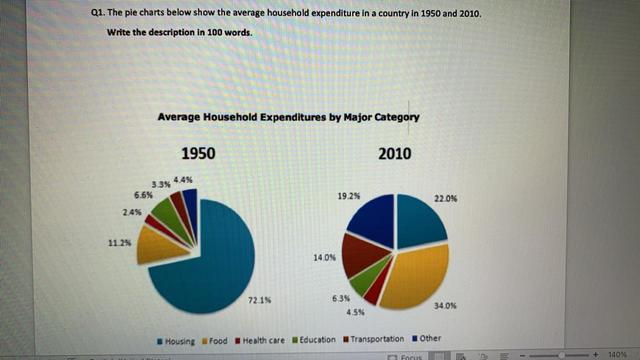
pie chart illustrates the comparison of the average household investments in a nation in 1950 and 2010.
Verb problem
apply
Overall
, the major expenditure among all was done in housing in 1950, whilst in 2010, the investment was done in Linking Words
food
category. Other categories Add an article
the food
also
showed some notable changes except education which contributed a minute increase in Linking Words
the
expenditure in 2010.
Correct article usage
apply
Linking Words
While in
1950, housing occupied nearly more than half of the expenditure, Correct word choice
In
Linking Words
then
followed by food with 11.2%, but in 2010, Rephrase
apply
this
trend Linking Words
got
reversed and Verb problem
apply
food
category was Correct article usage
the food
at
the highest among all categories with 34%, Change preposition
apply
Linking Words
then
followed by housing with 22%.
The three categories namely, health care, transportation and others have Rephrase
apply
been
increased their spending to 4.5%, 14% and 19.2%, respectively. The only portion that showed a little change was education Unnecessary verb
apply
that got
decreased with a minor difference of around 0.2%.Verb problem
which