
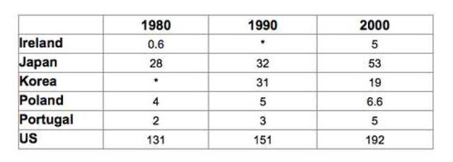
The provided illustration delineates the proportion of produced rubbish in a number of nations during 3 decades. Data are calculated in millions of tones.
Overall
, a glance at the table reveals that over the period, the US by far was the dominant state in Linking Words
this
negative trend. Linking Words
Additionally
, the ratio of generated wastage in Japan and Korea was really exaggerated. Linking Words
While
the volume of litter production in other countries can be overlooked.
In detail, the quantity of created waste in the USA was the greatest proportion and accounted for 131 in 1989, the figure surged in later years and hit a pinnacle in 2000, to 192. Japan witnessed 28 times waste production higher than Korea in 1980, these numbers were approximately identical in 1990 when they reached 32 and 31, the data for Japan doubled and in Korea halved in 2000 compared to the previous decade.
Linking Words
On the contrary
, Ireland, Poland and Portugal experienced a slight sour over the span, the data for all these regimes was lower than 6.6.Linking Words