
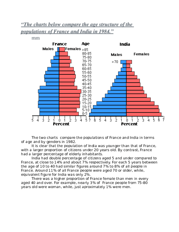
The graphs depict two countries in terms of age distribution by gender in the year 1984.
Overall
, the population of India was younger than that of France in 1984, with a noticeably larger proportion of younger people. France, Linking Words
on the other hand
, had a significantly larger percentage of elderly inhabitants.
Linking Words
Firstly
, the older the Indian population got , the fewer the number of people were, with the exception being those more than 70 . In the European country, there were fewer children (5-10) , at 6.5% , than babies (0-5). Next , between adolescents (10-15) and adults (30-35), the number was very similar, being around 8% . The number Linking Words
then
decreased from 35 to 45 years ,reaching 4,5%. It Linking Words
then
dropped until 50-55 years, before finding the same logic as India (with a little exception at 65 to 70).
Linking Words
Secondly
, it is possible to notice that the French lived on average until much older. Indeed, the above 70 years category shows less than 3% in India , Linking Words
while
the French elderly respond to 9%Linking Words