
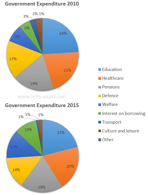
The pie charts provide data about local government
expenditure
in 2010 and 2015.
Use synonyms
Overall
, both in 2010 and 2015 education had the highest Linking Words
expenditure
Use synonyms
rate
.
As can clearly be seen, in 2010 education had the highest Use synonyms
expenditure
Use synonyms
rate
with 24 per Use synonyms
cent
. The rates of expenditures on healthcare, pensions and defence were pretty similar Use synonyms
with
21 per Change preposition
at
cent
, 19 per Use synonyms
cent
and 17 per Use synonyms
cent
respectively. In 2010 the least amount of money was spent on Use synonyms
other
accounting for 1 per Fix the agreement mistake
others
cent
.
In 2015, education had the highest Use synonyms
expenditure
Use synonyms
rate
with 21 per Use synonyms
cent
. The Use synonyms
rate
of Use synonyms
expenditure
on healthcare was 20 per Use synonyms
cent
, Use synonyms
whereas
pensions had 19 per Linking Words
cent
. The percentages of Use synonyms
expenditure
on defence, interest on borrowing and welfare were pretty similar with 14 per Use synonyms
cent
, 10 per Use synonyms
cent
and 13 per Use synonyms
cent
respectively. In 2015 the rates of expenditures on transport, culture and leisure and Use synonyms
other
was the same accounting for 1 per Fix the agreement mistake
others
cent
.Use synonyms