
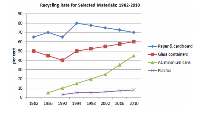
The given diagram illustrates the recycling activity for 4 different materials in a particular country for the 28-year time span, from 1982 to 2010.
Overall
, the graph charts show the recycling rate of 4 observed items: paper and cardboard, glass containers, aluminium cans, and plastics, from 1982 to 2010. Linking Words
While
the ranking between items was stable for the reported years, there was a high surge for aluminium cans.
Linking Words
First,
paper and cardboard were always in the top position from 1982 to 2010. Despite increasing to 80% of recycling rate from 1982 to 1994, it kept decreasing to 70% in 2010. Linking Words
On the contrary
, the glass containers which were placed in the second rank, showed an inverted pattern where it decreased from 50% to 40% in 1990, before consistently moving up to 60% in 2010.
Aluminium cans followed on the third post, showed an impressive run of improvement number from under 10% in 1986 to almost 45% recycling rate in 2010. Plastics, Linking Words
however
, Linking Words
while
showing the same increment pattern, the record still shows below 10% of recycling activities.Linking Words