
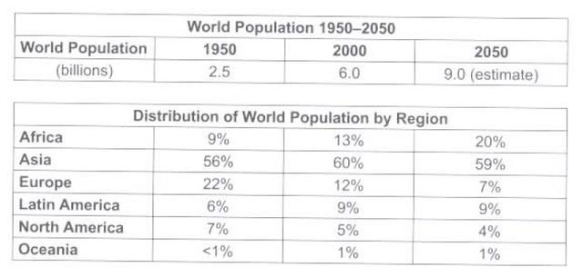
The tables illustrate the data of global inhabitants in a 100-year period of time, from 1950 to 2050, complete with its distribution in a varied continent.
Overall
, it can be seen that the number of global residents remains increasing every 50 years, Linking Words
while
Asia took the lead as the largest population among others.
Depicting from the first table, it is shown that 2.5 billion people were captured by the data as the total population during 1950. Linking Words
Moreover
, it rose by more than 2 times, specifically 6 billion human beings in the year 2000. The growth hasn't stopped there yet, in fact, the chart made an assumption that in 2050 the occupant will reach up to 9 billion.
In the second table, Asia took the largest percentage of world citizens by the number 56% and continued the growth by 4% in 2000, just exactly before it was predicted to be slightly shrunk by 1% in 2050. Linking Words
On the other hand
, the land of Africa keeps putting up their level of distribution percentage, starting from 9% in 1950 and roughly doubling its amount for 2050 prediction. Linking Words
In contrast
, other countries have different cases than these two, Linking Words
for instance
, Europe and North America which remain shrunk, creating a pattern that Linking Words
also
gives them a future reading that it will mostly decrease by 1 to 5 per cent in 2050. Compared to others, there are Latin America and Oceania that categorized as the most steady forecast, merely 1% and 9%.Linking Words