
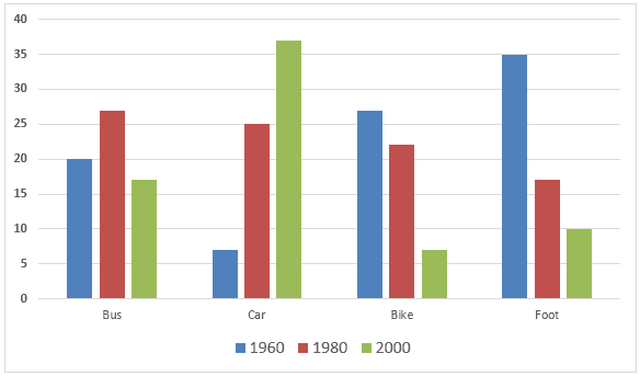
The bar chart illustrates the percentage of commuters by various types of public and private transportation in 1960, 1980 and 2000 used by the population of one European city.
Overall
, people's preferences during the years changed, with the car and tube remaining around the same rate, with the commute by car significantly increasing in popularity and the bus percentage going down.
Looking at the train statistics, the percentage of commuters varied from almost 20 to roughly 30, with a spike in 1980. The total of Linking Words
persons
using the tube was Replace the word
people
also
kept in a small range of 20 to 30%, with the lowest point in 1980.
Linking Words
While
the number of car users went up from a little above 5 per cent in 1960 to almost 40% in 2000, the opposite effect can be seen in the numbers regarding the bus commuters, who only went down from 1960, where up to 40% of the people used it, to as little as 15% in 2000.Linking Words