
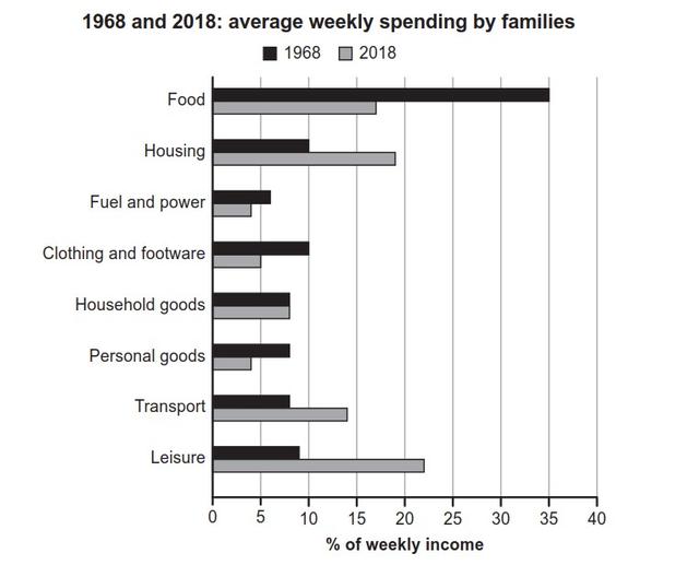
The diagram illustrates the difference in the spending of the families' income in 1968 and 2018.
Overall
, the citizens spent most of their salary on Food in 1958 Linking Words
whereas
leisure items gained the highest proportion of their wages in 2018.
In terms of the highest amount of spending, food shared 35% in 1968 Linking Words
while
leisure activities gained just more than 20% in 2018. Linking Words
On the other hand
, residents used the least in the category of fuel and power in both 1968 and 2018 with Linking Words
the
Correct article usage
apply
percentage
of less than 5% and just more than 5% respectively.
In detail, the food indicated the greatest change in the ratio as it plummeted from 35% to just more than 20%. Fix the agreement mistake
percentages
In contrast
, household goods did not have any change in the proportion.Linking Words