
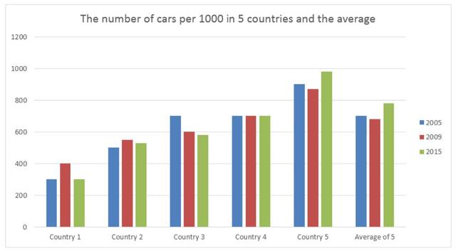
The given graph indicates the data about how many cars are divided among 1000 people in various 5 European countries and juxtaposed with European averages in 2005, 2009, and 2015.
Overall
, it is evident from the chart that the preference for Linking Words
Country
5 had the highest share with above 1000 in all three years Use synonyms
whereas
Linking Words
Country
1 ranked the lowest amount under 400 at the same time.
Looking at the details, the number of cars in Use synonyms
Country
4 reported the same portion with 700 all the time Use synonyms
while
the indicator of Linking Words
Country
3 started at 700 and followed a gradual decline Use synonyms
then
reached approximately 600 in 2015. Linking Words
Moreover
, the object for Linking Words
Country
2 changed between 400 and 600 and proportions were much closer to each other compared with the average of all countries accounting for 700 and nearly 800 in 2005 and 2015, respectively. Use synonyms
Furthermore
, Linking Words
Country
1 followed the same pattern and did not any distinction in both 2005 and 2015.Use synonyms