
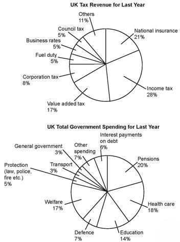
The pie charts give data on different types of UK
tax
revenue and the total UK government spending Use synonyms
last
year. Units are measured in percentages.
Linking Words
Overall
, what stands out from the graphs is that the main revenue source was Linking Words
income
Use synonyms
tax
, Use synonyms
while
the largest amount of Linking Words
income
was spent on pensions. Another interesting detail is that the government allocated the least amount of Use synonyms
money
on transportation Use synonyms
last
year.
Looking into details, regarding the Linking Words
tax
Use synonyms
income
, Use synonyms
income
Use synonyms
tax
ranked first with 28%,which is followed by national insurance (21%). The percentage of Use synonyms
money
gained from value-added Use synonyms
tax
was 17%, Use synonyms
while
the figure for corporation Linking Words
tax
was 8%. The remaining Use synonyms
income
sources were at just above a quarter, Use synonyms
total
.
In terms of government spending, the largest amount of Change preposition
in total
money
was spent on pensions at one in five, Use synonyms
while
Welfare ranked second with 17%. The percentage of Linking Words
money
invested in Education was 14% which was twice as much as that in other spending and defence. The remaining industries were at just below one in five, Use synonyms
total
.Change preposition
in total