The two pie charts show the percentage of pollutants entering a particular part of ocean in 1997 and 2007. Summarize the information by selecting and reporting the main features, and make comparisons where relevant.

The two pie charts show the percentage of pollutants entering a particular part of

ocean in 1997 and 2007. Summarize the information by selecting and reporting the

main features, and make comparisons where relevant.
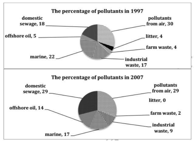
A glance at the pie charts depicts the proportion of several types of pollutants reaching a specific point in the ocean in 1997 and 2007.
Overall
, it is clear from the graphs that the highest contribution to the ocean's pollution was
waste
produced from air and domestic sewage regardless of the year.
However
, the lowest reason
of
Change preposition
for
show examples
the dirty oceans
were
Change the verb form
was
show examples
litter and farm
waste
. It can be deduced from the graph that air pollutants affect the most with 30% and 29% in 1997 and 2007, respectively. Indeed, domestic sewage was 18% in 1997 and 29% in 2007. Some contributors were considerably moderate namely marine, industrial
waste
and offshore oil.
However
, litter and farm
waste
didn't show a remarkable change in values (less than 4%) in both years.
Submitted by s116656m on

Unauthorized use and/or duplication of this material without express and written permission from this site’s author and/or owner is strictly prohibited. Excerpts and links may be used, provided that full and clear credit is given to Writing9 with appropriate and specific direction to the original content.

Linking words: Don't use the same linking words: "however".
Common mistake: Your writing should be 150-250 words.
Vocabulary: Replace the words waste with synonyms.
Vocabulary: The word "graphs" was used 2 times.
What to do next:
Look at other essays: