The table below shows the results of surveys in 2000, 2005 and 2010 about one university. Summarise the information by selecting and reporting the main features, and make comparisons where relevant.

The table below shows the results of surveys in 2000, 2005 and 2010 about one university.

Summarise the information by selecting and reporting the main features, and make comparisons where relevant.
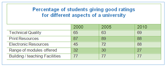
Given is a figure illustrating percentages of positive responses to various aspects of a university by a 5-year interval in 2000, 2005 and 2010. An interesting fact highlighted by the figure is that printing resources and teaching facilities at the university were the most widely enjoyed
,
Remove the comma
apply
show examples
since at least 84% and 77% of students were satisfied with them respectively.
Mediocre
Correct article usage
A mediocre
show examples
field, meanwhile in 2000 was electronic resources as approximately half of the
surved
Correct your spelling
curved
surveyed
ones
at
Change preposition
apply
show examples
45% commented it positively.
However
, after merely a ten-year period, in 2010 it succeeded in gaining twofold positive at 88% responses . In stark contrast,
however
, modules presented by the university were unpleasant on the part of students
due to
the fact that not only just a third of students ratted it to be proper in 2000,
positive responses
Add the word(s)
but positive responses also
show examples
declined to 27% in 2010
Submitted by golriiz23 on

Unauthorized use and/or duplication of this material without express and written permission from this site’s author and/or owner is strictly prohibited. Excerpts and links may be used, provided that full and clear credit is given to Writing9 with appropriate and specific direction to the original content.

Linking words: Don't use the same linking words: "however".
Introduction: The introduction is missing.
Introduction: The chart intro is missing.
Common mistake: Your writing should be 150-250 words.
Introduction: The chart intro is missing.
Vocabulary: Only 6 basic words for charts were used.
Vocabulary: The word "figure" was used 2 times.
Topic Vocabulary:
  • survey
  • results
  • university
  • 2000
  • 2005
  • 2010
  • main features
  • comparisons
  • relevant
  • trends
  • responses
  • time
  • significance
What to do next:
Look at other essays: