
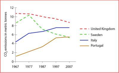
The line chart compares the carbon dioxide
emissions
per head in four different countries throughout four decades, from 1967 to 2007. The countries include the United Use synonyms
Kingdom
, Use synonyms
Sweden
, Italy, and Portugal.
In general, carbon dioxide Use synonyms
emissions
in Italy and Portugal rocketed up Use synonyms
while
the United Linking Words
Kingdom
and Use synonyms
Sweden
decreased. On top of that, the United Use synonyms
Kingdom
always had the highest metrics throughout the given time.
Use synonyms
Similarly
, Italy and Portugal had a small contribution to CO2 Linking Words
emissions
in the first year. In 1967, Italy's emission value was 4 Use synonyms
tonnes
, but it went up roughly to about 8 Use synonyms
tonnes
ten years later. Use synonyms
However
, it managed to slightly drop to around 7.5 Linking Words
tonnes
in the Use synonyms
last
period. Same case as Italy, Portugal was the lowest country in terms of CO2 Linking Words
emissions
, starting with only more than 1.5 Use synonyms
tonnes
, Use synonyms
then
gradually reaching its peak at nearly 4.5 Linking Words
tonnes
, and Use synonyms
finally
, it was stable at that value until the Linking Words
last
year.
Linking Words
On the contrary
, the United Linking Words
Kingdom
and Use synonyms
Sweden
managed to lower the number of Use synonyms
emissions
. The United Use synonyms
Kingdom
showed a steady fall from the highest with approximately 11 Use synonyms
tonnes
to only 9 Use synonyms
tonnes
in 2007. Despite a little bounce from 8 to over 10 Use synonyms
tonnes
in the first decade, Use synonyms
Sweden
was able to decline the trend as well, to being the least emission country Use synonyms
at the end
of the period with around 5 Linking Words
tonnes
.Use synonyms