
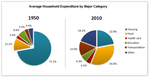
The pie chart gives information about the general household costs related to two different years, 1950 and 2010, in a specific county.
Overall
, we can see that the chart considers six kinds of expenditures. Linking Words
Moreover
, we can notice a drastic change in the amounts of money spent in the relative categories. The expenditures in housing, which covered Linking Words
the
72.1% in 1950, went through a period of decline, covering only Correct article usage
apply
the
22% in 2010. Correct article usage
apply
Additionally
, it is evident the significant growth of payments in food, which represents the biggest part of costs in 2010.
More detailed, Linking Words
it
can Correct pronoun usage
we
be seen
a moderate growth in the quantity of payments related to transportation, health care and others, which experienced a rise from 2,4%, 3,3% and 4,4% to 4,5%, 14% and 19,2% respectively.
Wrong verb form
see
Furthermore
, the chart indicates that the only kind of cost that decreased in percentage across the two years was education, which went through a minimal drop of 0,3%.Linking Words