
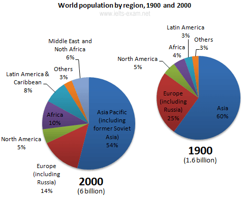
The two pie charts illustrate changes in
population
of different areas of the planet between 1900 and 2000.
Add an article
the population
a population
Overall
, the pie charts Linking Words
represents
a tremendous increase Change the verb form
represent
of
the Earth’s population, most of the growth occurred in developing countries. Asia as a region was the most populated Change preposition
in
while
the smallest number of people lived in Linking Words
African
continent.
In Add an article
the African
details
, the ratio of Asian and European regions declined over the century. Europe’s ratio dropped from 25% to 14%, Fix the agreement mistake
detail
while
Asia declined from 60% to 54%.
Linking Words
On the other hand
, the percentage of people living in Africa more than doubled from 4.5% to 10%, Linking Words
while
Latin America’s proportion almost tripled in the same period (from 1900 to 2000). North America’s percentage Linking Words
Linking Words
however
, remained constant at 5% in 1900 and 2000. The Middle East and North Africa, a new category in 2000, represented 6% of Add the comma(s)
,however
world
population.Add an article
the world