
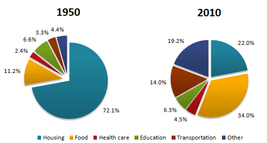
The pie charts illustrate the average
consumptions
of Fix the agreement mistake
consumption
family
in a Fix the agreement mistake
families
coutry
in two different years, 1950 and 2010. It clearly depicts Correct your spelling
country
that
the changes in expenses of different household items in these two years.
Correct word choice
apply
Overall
, there are 6 categories of household expenditures which are housing, food, health care, education, transportation, and Linking Words
other
. Specifically, in 1950, the expense of housing took the largest part; Correct pronoun usage
others
however
, in 2010, the majority of Linking Words
money
was spent on food.
First of all, we can observe the biggest difference Add an article
the money
of
Change preposition
between
Linking Words
this
two pie charts is that housing Correct determiner usage
these
shrinked
dramatically. Correct your spelling
shrank
In particular
, people spent 72.1% of their budget on housing in 1950, Linking Words
whereas
Linking Words
poeple
spent only 22% on housing in 2010. Correct your spelling
people
Similarly
, people's expenses on education dropped slightly from 6.6% in 1950 to 6.3% in 2010.
Linking Words
On the other hand
, Linking Words
other
four categories increased Correct article usage
the other
at
the same period. The largest part was Change preposition
in
food
which accounted for 34% in 2010; Add an article
the food
however
, it only took 11.2% in 1950. Linking Words
Next
, people spent 19.2% on Linking Words
other
in 2010, Correct pronoun usage
others
while
it only accounted for 4.4% in 1950. Linking Words
Moreover
, the average expense of transportation was 14% in 2010 and it was merely 3.3% in 1950. Linking Words
Last
but not least, the budget Linking Words
of
health care rose to 4.5% in 2010, which was only 2.4% in 1950.Change preposition
for