
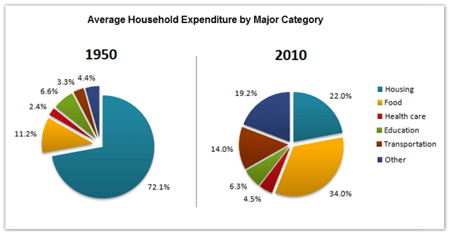
The pie charts compare the mean household
spendings
in a nation by six major categories in 1950 and 2010.
Fix the agreement mistake
spending
Overall
, lodgings and food were the two most spent upon categories, which covered more than half of both years' percentage of expenditure. The percentage spent on housing in 2010 fell significantly Linking Words
while
the food section increased.
Linking Words
Firstly
, compared to 1950, housing which had 72.1% dropped by 50.1% in 2010. Linking Words
However
, nourishment Linking Words
that
had 11.2% in 1950 became the leading category in 2010 with 34%. Correct pronoun usage
which
In addition
, others and vehicles which only compiled 4.4% and 3.3% respectively in 1950 had a surprising growth of 10%-15% each.
Meanwhile, medical care was the lowest bunch of Linking Words
the
group for both years which only had slight improvement after 60 years from a sorrowful 2.4% to a mere 4.5%. Correct article usage
apply
Similarly
, the education field had not seen a huge change, it had experienced a decrease of 0.3%, from 6.6% in 1950 to 6.3% in 2010.Linking Words