
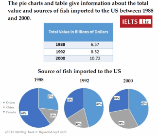
The first table depicts the profit which is measured in dollars,
while
the pie diagram indicates the location of imported fish which is categorized into three countries. In general, the value had Linking Words
a
greater number in 1988 than in 2000. Correct article usage
apply
Moreover
, all sources imported to the US revealed upward trends for the total value, Linking Words
whereas
only Canada had a downward tendency.
In detail, the value of dollars in trading fish rose moderately from 6,57 in 1988 to 8,52 in 1992. Linking Words
This
Linking Words
also
continued growth until 10,72 in 2000.
Linking Words
On the other hand
, from Canada to the United States, there was a declining percentage from 1988 to 2000 which altered from 60% to 28%. Linking Words
In contrast
, the number of trading fish from China rose dramatically from 13% to 30%. Other countries followed a similar pattern to that of China, which shot up from 27% to 41%, and Linking Words
this
one is the highest percentage in 2000.Linking Words