
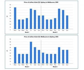
The given diagrams demonstrate the amount of money used for airline tickets between
two
Australian cities, namely Sydney and Melbourne over a period of Use synonyms
two
weeks in 2013.
Looking from an Use synonyms
overall
perspective, the Linking Words
two
places witnessed the same trend, to be more specific, the flying cost seems to remain stable on weekdays and became much higher on the Use synonyms
last
days of the week.
With regard to the first chart, there was a considerable decline in the cost on Monday between the Linking Words
two
weeks, from 80 to 50 dollars. Use synonyms
However
, in the next six days, both weeks saw a similar trend. From Tuesday to Thursday, it stayed over the price of 35 dollars before rising sharply to 75$ on Friday. After that, at the weekend, the prices decreased steadily to 70 and 50 dollars respectively.
From Melbourne to Sydney, the same trend was Linking Words
also
recorded. There was a drop of 20$ on Monday and especially FridayLinking Words
,
when people had to spend the highest amount of money in the first week, at 80$ . Remove the comma
apply
Additionally
, the cost during other weekdays and weekends was maintained at 35 and 50$, except for a fall of 10$ on Saturday.Linking Words