
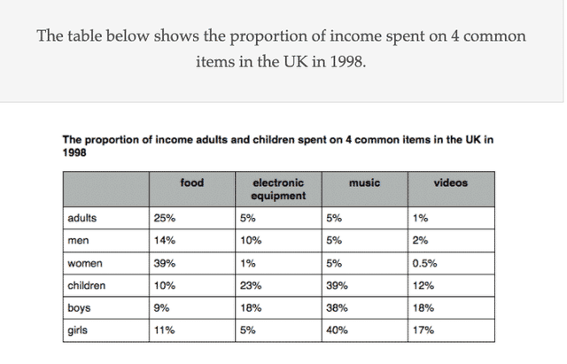
The table diagram illustrates the percentages of income,which was spent on food,electronic equipment,music and videos in the UK in 1998.
Overall
,Linking Words
that is
clear that every Linking Words
section
has a leader of the chart,which differs significantly.It can be seen that all age groups were the leaders in some areas ,except men and adults.
In the food ,Use synonyms
section
it can be seen that Use synonyms
women
bought it the most(39%),Use synonyms
while
others barely had a Linking Words
number
higher than 10,except men.,Use synonyms
However
in the other Linking Words
section
,which is electronic equipment, Use synonyms
women
had a notable fall to 1%,Use synonyms
while
children rose to 23% and took the first place.
In the music ,Linking Words
section
children went in second place after girls whose percentage Use synonyms
number
is 40.,Use synonyms
Besides
it can be observed that adults,men and Linking Words
women
had the same Use synonyms
number
(5%),which made them outsiders.In the video ,purchases all the members had a score lower than 20.Use synonyms
Moreover
,some of them,like Linking Words
women
,even had a Use synonyms
number
lower than 1%,which made them the total outsidersUse synonyms