
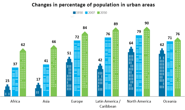
The chart illustrates the amount of the population that lives in urban areas in general and in specific parts of the world at three different times.
Overall
, it can be seen that in Europe, North and Latin America, the percentages are higher than the other two continents remaining, especially for how concerned the perspective amount is in 2030.
A more widely look reveals that in each continent is present an increase of people in urban areas, Indeed World in 1950 accounted for only 29% of people living in urban areas but Linking Words
this
rose to 49% in 2007 and will reach 60% in 2030, so if we compare to the starting point the number is doubled.
Africa and Asia have very similar amounts, Linking Words
for example
in 2007 the first accounted for 15% and the second one was 17%, These two maintained Linking Words
this
trend over the years. North America makes up the greatest percentages in all the years and is represented by a steady increase.Linking Words