
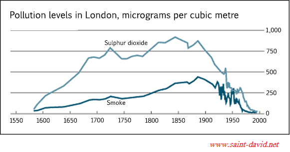
The graph illustrates the transitions in the amount of
sulphur
Use synonyms
dioxide
and smoke emitted in London from 1600 to 2000. Use synonyms
Overall
, the former stands higher than the latter throughout the whole examined period.
Linking Words
According to
the graph, there are generally rising trends in the level of pollution of Linking Words
sulphur
Use synonyms
dioxide
and smoke until 1880. Use synonyms
For example
, the former rises dramatically from 20 in 1580 to 760 micrograms in 1728. Linking Words
While
it experienced a small decline toward 1750, it continued to surge until 1850 when the largest amount of Linking Words
sulphur
Use synonyms
dioxide
was emitted. Regarding the emission of smoke, it Use synonyms
also
continuously rose to reach nearly 500 in 1880. Linking Words
However
, the change is less drastic than that of Linking Words
sulphur
Use synonyms
dioxide
.
In spite of the upward trends until 1880, both graphs start to fall suddenly. Indeed, the most dramatic fluctuations occurred between 1920 and 1970 as they tended to drop gradually. After that, both graphs fall sharply and eventually hit the bottom at 0 by 2000.Use synonyms