
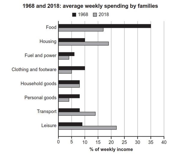
The chart illustrates the proportion of money which was spent weekly by people in a particular country between 1968 and 2018.
Overall
, it can clearly be seen that the most remarkable weekly spending was on food with a 35% ratio in 1968 and about 25% after 50 Linking Words
years
, to compare fuel and power consumptions which were less consumed and pointed to just about 5% in both periods given.
Looking into the data in more detail, people in that area preferred to buy more food for their salary and it showed the highest point with a rate of 35% in 1968, Use synonyms
while
it dropped considerably to above 15% in 2018 Linking Words
years
. In comparison, Fuel and power were less considered critical and were distributed by households just around 5% of their fee in 1968 and in 2018 Use synonyms
years
.
In 1968, families’ expenditures on housing, transport and leisure showed approximately 8% and after 50 Use synonyms
years
they nearly doubled, Use synonyms
whereas
clothing and footwear, household and personal goods were afforded by individuals just above 5% in both eras given.Linking Words