
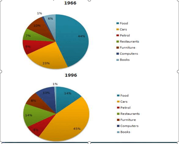
The pie charts contrast the expenditure on 7 certain sections by American citizens in 1966 and 1996.
Overall
, the figure showed that Americans spent more amount of money on bread and cars than other remaining items in both years.
Linking Words
Nevertheless
, there were numerous changes in American people's expenses from 1966 to 1996.
In the year1966, bread and car are two goods that citizens mostly used their budget to purchase, at about 44% for feed and 23% for cars, Linking Words
In contrast
, people are less likely to spend on 4 other sections with similar percentages, including 9% on petrol,7% on restaurants,10% on furniture and only 6% on books. Linking Words
Likewise
,computers were the Linking Words
last
expensed division by exactly 1% in 1966.
In1996, the figures for car expenditure/spending increased by twofold at 45% compared to that in 19666.Linking Words
On the contrary
, the consumption of bread decreased dramatically to 14% and was equal to that of restaurants,which jumped and doubled since 1966. Meanwhile, the proportion of the two sections, petrol and furniture almost stayed the same , at 8% for both. Another visible trend was that computer expenditure surged to 10% Linking Words
while
that of books dropped to 1%.Linking Words