
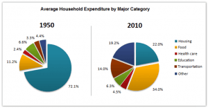
the two Pies chart gives information about the proportion of
household
Use synonyms
expenditure
in six Major categories, Use synonyms
hence
, from 1950 and 2010 in one country.
Linking Words
Overall
, Linking Words
initially
, the average Linking Words
household
Use synonyms
expenditure
in 1950, had only one biggest slice was housing, Use synonyms
while
other slice showed a steady average without the Linking Words
Food
Part, Use synonyms
Whereas
, in 2010 the major category begin with Linking Words
food
Use synonyms
then
housing and others have the same proportion.
as we see in these two pie charts, will begin with, Average Linking Words
household
Use synonyms
expenditure
in the year 1950Use synonyms
?
The large slice was housing had an average of 72.1 per Change the punctuation
.
cent
Use synonyms
while
others , health care and transportation, were the same average between 2.4 and 4.4 per Linking Words
cent
, Use synonyms
in contrast
, Linking Words
food
was the second category, had 11,2 per Use synonyms
cent
and Use synonyms
then
education at 6,6 proportion, comparatively with 2010, the average Linking Words
household
Use synonyms
expenditure
, the highest piece was in Use synonyms
food
34,0 per Use synonyms
cent
, Use synonyms
in addition
, Housing and other remains the same in the percentages, Linking Words
while
in transportation has 14 per Linking Words
cent
of users, in the Use synonyms
end
the health care increased by 2 per Add the comma(s)
,end
cent
, compared with the year 1950, Use synonyms
also
education remained constant in both years.Linking Words