
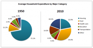
The pie chart illustrates the average family expenses in one nation between 1950 and 2010.
Overall
, the most money was spent on housing in 1950, Linking Words
in contrast
, food was the most valuable thing in 2010. In 1950, housing had the highest percentage, but, all expenditures had approximately equal expenses in 2010.
Turning to the details, food was important for both periods with 11.2% and 34% in 1950 and 2010 respectively. In 2010, people needed food and spend most of their wages. Health care was the lowest expenditure in both times with 2-4 %. Housing had crucial importance in 1950 with 72%, Linking Words
however
, it was 22% in 2010. People started to spend less on housing.
As you can see transportation expenses increased since 1950 from 3% to 14%. Linking Words
Moreover
, the public started to spend more on other things by 15%. Linking Words
This
led to an insignificant decline in education expenditures over 6 decades.Linking Words