
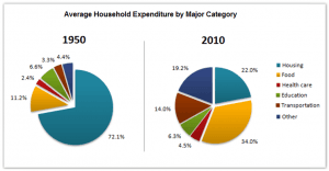
The pie charts give information about household expenditure on goods and services between 1950 and 2010.
The proportions between 1950 and 2010 are different. In 2010, housing plummeted from 72.1% in 1950 to 22.0% in 2010. Food in 1950 climbed to 34.0% in 2010. Health care rose at a slower pace from about 2.4% to 4.5%. In 1950, education fell gradually more than about 0.3 per cent. Transportation soared clearly from 3.3% to 14.0% a growth of approximately 10.7%. The
last
other one in 1950 has just 4.4% less than in 2010 around 19.2%, it rise of around 14.8%.
In between two years, some things decline some things rocketed, Linking Words
for example
In 1950 housing, food, health care, transportation and others rose in 2010, but only one education fell in 2010.Linking Words