
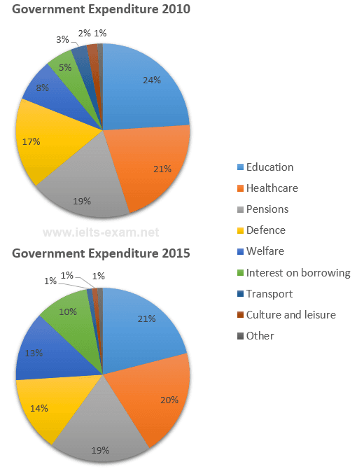
The pie chart illustrates spending on the different categories in the
years
2010 and 2015 Use synonyms
such
as Education, Health care, Pensions, Defense, Welfare, Interest on borrowing, Transport, Culture and leisure and others.
Linking Words
Overall
, the highest amount of money is spent on Education and the least amount is spent on Culture and Leisure and Other.
Linking Words
Firstly
, in the year 2010 Education has a high cost in the year 2015 24% and 21% respectively. Followed by Healthcare has the second most expense made by local government is 21% in 2010 and 20% in 2015. In ,addition Pension funds are the same as these two Linking Words
years
about 19%.
Use synonyms
Furthermore
, some of the expenses are very low is by the government Culture and leisure, other and Linking Words
lastly
Transport is less than 3% in the Linking Words
years
2010 and 2015. Use synonyms
While
spending like Interest and borrowing changed somehow in the year 2010 amounting is about 5% it increased to 10% which is a major change. But, the Defense cast has been lowered by Linking Words
years
is 17% to 14%. And the Welfare has not much difference is about 2%.Use synonyms