
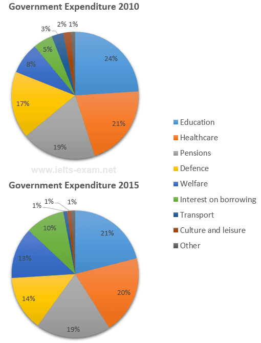
The pie charts illustrate the authority disbursement broken down into categories in 2010 and 2015.
Overall
, what stands out from the graphs is that the highest number was observed in Healthcarecare Linking Words
whereas
the lowest was in other categories .
Linking Words
According to
the chart , it is significant to note that healthcare had the majority of expenses in both years 21% and 20% respectively .Linking Words
Furthermore
, the highest proportion was in Education 21% in 2010 , followed by the same category in 2015 , with only 4% less than the previous year. Linking Words
However
, in the given years the pension category was identical at 19% .In 2015 the Internet and borrowing were almost twice as much as in 2010(10 versus 5) .
At looking the graph, the expenditure increased in Transport by only 5% in 2015 , as a comparison the defence experienced a decrease of only three Linking Words
percent
to reach 14% in 2015. Change the spelling
per cent
Finally
, the remained category was relatively uniform and changed from 1% to 3%.Linking Words