
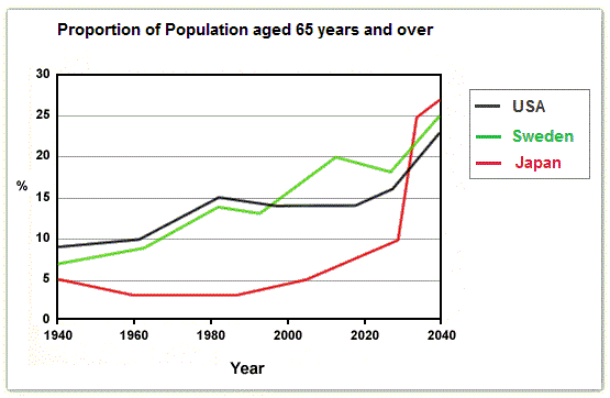
The graph illustrates the figures for inhabitants aged 65 and older from 1940 to 2040 in various nations.
Overall
, the three countries have had a strong increase in the number of elderly people during the century. We notice , Linking Words
however
, that they each had paths very distinct to reach eventually the same numbers.
Linking Words
To begin
with,the United States of America started with the oldest population in 1940, at over 8 per cent, Linking Words
whereas
Japan was the youngest at exactly 5 per cent. Sweden was in between at 7. In the following years, the numbers went up for both Western countries but decreased for the Asian nation. Around 1995, Sweden overtook the USA.
1995 Linking Words
also
corresponds to the date when Japan retook its growth. In 2027, the oriental state will have a sudden explosion in the proportion, going from a tenth to more than a quarter in 2040. The European and American countries will follow up closely, but with a less exponential evolution, causing Japan to gain the 1st place.Linking Words