
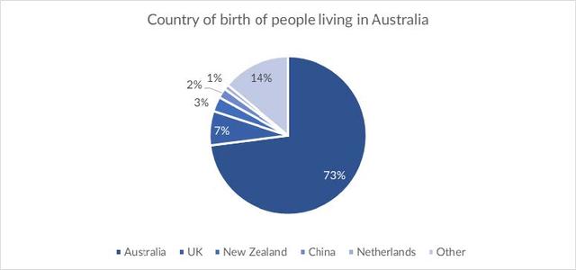
The pie chart shows the percentage of
people
living in Australia with different nationalities and the table illustrates where these Use synonyms
people
dwell.
Use synonyms
Overall
, A majority of residents were born in Australia. It is obvious that urban areas are the most Linking Words
favorable
place to live for Australian.
Change the spelling
favourable
According to
the pie chart, Australia is the birthplace of 73% population. Dwellers from other countries accounted for 14%, which is twice as much as the UK. Linking Words
Besides
, a similar allocation can be seen in the proportion of those who were born in New Zealand, China, and the Netherlands at 3%, 2%, and 1% respectively.
Looking more closely at the table, 99% of Chinese Linking Words
people
prefer living in a town compared to the proportion of New Zealand (80%). Meanwhile, Use synonyms
such
differences across categories are not seen in UK and Netherlands. Linking Words
Lastly
, the Australian natives accounted for 17% of Linking Words
people
living in remote areas.Use synonyms