
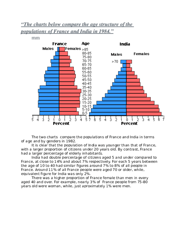
The charts below compare the age structure of the populations of
France
and Use synonyms
India
in 1984.
Use synonyms
Overall
, the Indian population is younger. The 0-5 Linking Words
years
represent the biggest part of the population in Use synonyms
India
at almost 14,5%Use synonyms
Punctuation problem
,
whereas
in Linking Words
France
the same category Use synonyms
acts as
only approximately 7 percent.
Verb problem
accounts for
Firstly
, the older the Indian population gets Linking Words
the
fewer the number of people they represent, with Punctuation problem
, the
a little
exception being the more than 70 Correct determiner usage
the
years
old . In Use synonyms
Use synonyms
France
it can be described as the followingPunctuation problem
France,
:
there are Punctuation problem
:
less
children (5-10) , at 6.5% Correct determiner usage
fewer
than
babies (0-5). Next , between adolescents (10-15) and adults (30-35Punctuation problem
, than
)
the number is very similar, being around 8% . The number Add a comma
),
then
decreases from 35 to 45 Linking Words
years
,reaching 4,5%. Use synonyms
it
Fix capitalization
It
then
increases until 50-55 Linking Words
years
, before finding the same logic as Use synonyms
India
(with a little exception at 65 to 70).
Use synonyms
Secondly
, it is possible to notice that in Linking Words
France
, we live on average until much older. Indeed, the above 70 Use synonyms
years
category Use synonyms
speak
for less than 3% in Correct subject-verb agreement
speaks
India
, Use synonyms
while
the Linking Words
elder
in Replace the word
elderly
France
respond to 9%Use synonyms