The diagram and chart beneath give data about deals and offer costs for Coca Cola.
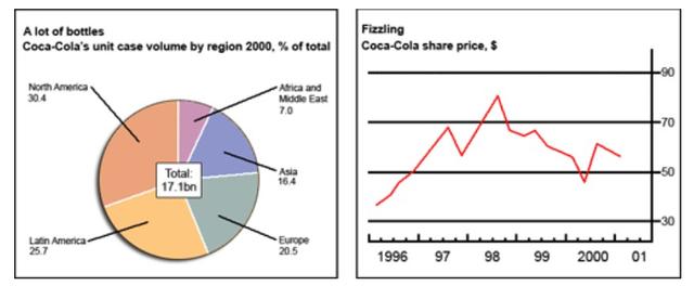
The diagram and chart beneath shows some kinds of numbers in terms of deals and offer that are
spended
for a particular company. In general, the pie chart shows percentages of total bottles that are used in several regions, Correct your spelling
spent
moreover
, there are two areas become
the major users of it. Meanwhile, the diagram serves Correct pronoun usage
that become
Correct article usage
a fluctuative
fluctuative
number of fizzling in Coca-cola share price, Correct your spelling
fluctuating
furhermore
, it reached its highest price in 1998 yet sharply decrease in the following years.
In 2000, the uses of Correct your spelling
furthermore
Coca-cola's
unit case was huge in Correct your spelling
Coca-Cola's
the
North America (30.4%)Correct article usage
apply
Submitted by ieltscuns2022 on
Unauthorized use and/or duplication of this material without express and written permission from this site’s author and/or owner is strictly prohibited. Excerpts and links may be used, provided that full and clear credit is given to Writing9 with appropriate and specific direction to the original content.
Linking words: Add more linking words.
▼
Basic structure: Write more paragraphs.
▼
Basic structure: Add more body paragraphs.
▼
Common mistake: Your writing should be 150-250 words.
Basic structure: Change the second paragraph.
▼
Basic structure: Write more paragraphs.
▼
Vocabulary: The word "chart" was used 2 times.
▼
Vocabulary: The word "diagram" was used 2 times.
▼
Vocabulary: The word "shows" was used 2 times.
▼
Vocabulary: Use several vocabularies to present the data in the second paragraph.
▼