
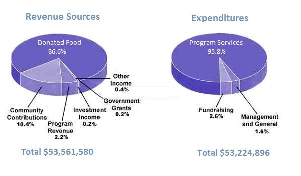
This
provided pie chart illustrates the money which was collected and spent by a charity for children in the USA in one year. It is obvious that the total earnings slightly exceeded all expenses. Linking Words
Moreover
, the first chart was divided into six figures Linking Words
while
the second one was composed of three categories.
At the outset, donated food accounted for most of the fund, at 86.6%, but the program services represented the majority of expenditures, at 95.8%.Linking Words
In addition
to that, the second largest Linking Words
income
for the charity was community contributions, at 10.4%, and it was around eight times less than the first Use synonyms
income
source.
Use synonyms
On the other hand
, the other sources of revenue were a minority compared to donated food, which was program revenue, investment Linking Words
income
, investment grants, and other Use synonyms
income
, at 3% combined. Use synonyms
Also
, the other expenditures were very small in comparison to program services, Linking Words
such
as fundraising, management and general which accounted for 4.2% combined. Though all the charity’s expenses, at 53244896 were high, the total revenue sources were at 53561580 and covered them.Linking Words