
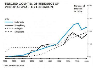
The given line graph illustrates the data about what percentage of students from various countries like Indonesia, Hong Kong, Malaysia and Singapore lived in Australia from 1982 to 2000.
Overall
, the trends show that the maximum number of residents were from Indonesia who migrated to Australia to study, Linking Words
however
, the least number of people occupying the accommodations were from Singapore.
The of students coming from Indonesia has increased steadily over the years, reaching the peak in 1998, in which almost more than 35000 visitors entered on study visas, after which a slight dip was seen to approximately 22000 applicants in the year 2000. Linking Words
Whereas
, applications from Hong Kong remained the same from 1982 to 1988, after which an increase was noticed, which kept on fluctuating throughout the given time.
Linking Words
On the other hand
, the lowest and most inconsistent applicants were from Malaysia and Singapore, reaching the highest figure of residents from these places, which was around 18000-2000 in 2000.Linking Words